Case Study: Lufthansa New Livery
Client: Lufthansa
Agency: Martin et Karzcinski
Location: Frankfurt FRA and Munich MUC
Usage: Digital, Print & Press, OOH & Trade
When Lufthansa unveiled its first major aircraft livery redesign in almost 30 years, the photography needed to do more than document a paint scheme—it had to introduce a new visual identity to the world. The refreshed brand, developed by Martin et Karczinski, represented a shift towards a more refined, premium aesthetic, and every image would become part of how millions of people first experienced the new Lufthansa.
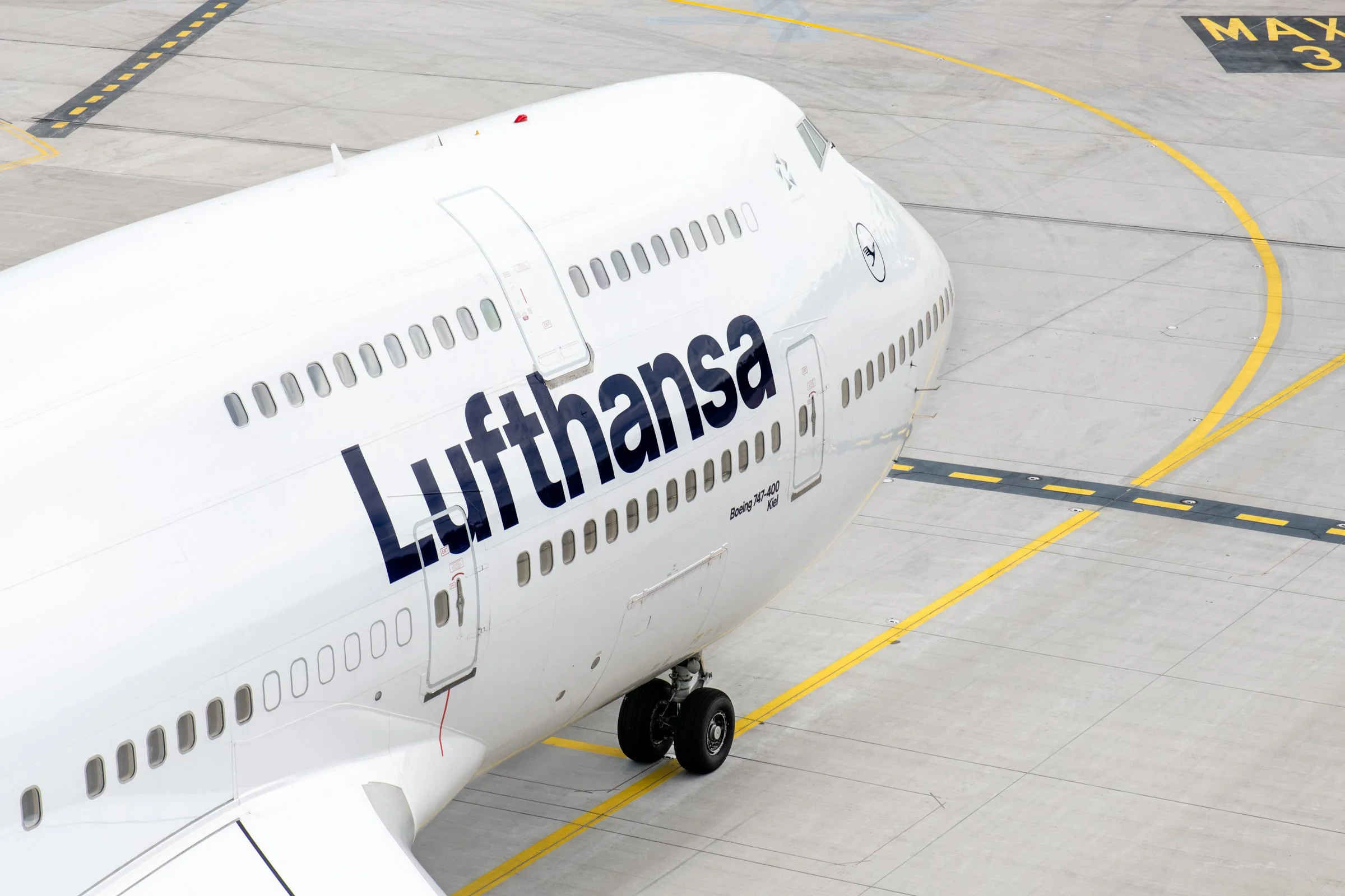
I was commissioned to create the official photographic library for the launch, capturing every aircraft type in the new livery, from the regional CRJ through to the Airbus A380, across Frankfurt and Munich. The photographs would be used globally across advertising, press, digital communications, internal brand assets and marketing materials.
The Challenge
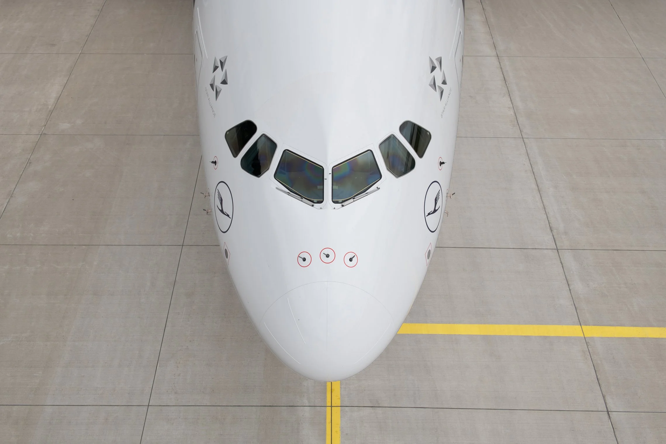
Photographing a fleet-wide rebrand is unlike photographing individual aircraft. The objective wasn't simply to record the new paintwork—it was to establish a visual language that reflected Lufthansa's new brand values.
The imagery needed to feel timeless, premium and unmistakably Lufthansa, while remaining completely consistent across a diverse fleet. Every aircraft presented different proportions, surfaces and operational constraints, yet the final collection needed to appear as though it had been created as one unified body of work.
Operationally, the assignment required extensive coordination with airport operations, maintenance teams and airline scheduling. Aircraft could only be photographed during narrow windows between commercial operations, meaning every shoot had to be carefully planned around constantly changing schedules. Weather, ramp activity, aircraft positioning and security restrictions all influenced what was possible at any given moment.
Because these photographs would become the public face of Lufthansa's new identity, there was very little margin for compromise. Every line, reflection and composition had to reinforce the precision and clarity of the new brand.
My Approach
Coming from a background in design and architecture, I approached the assignment differently from traditional aviation photography.
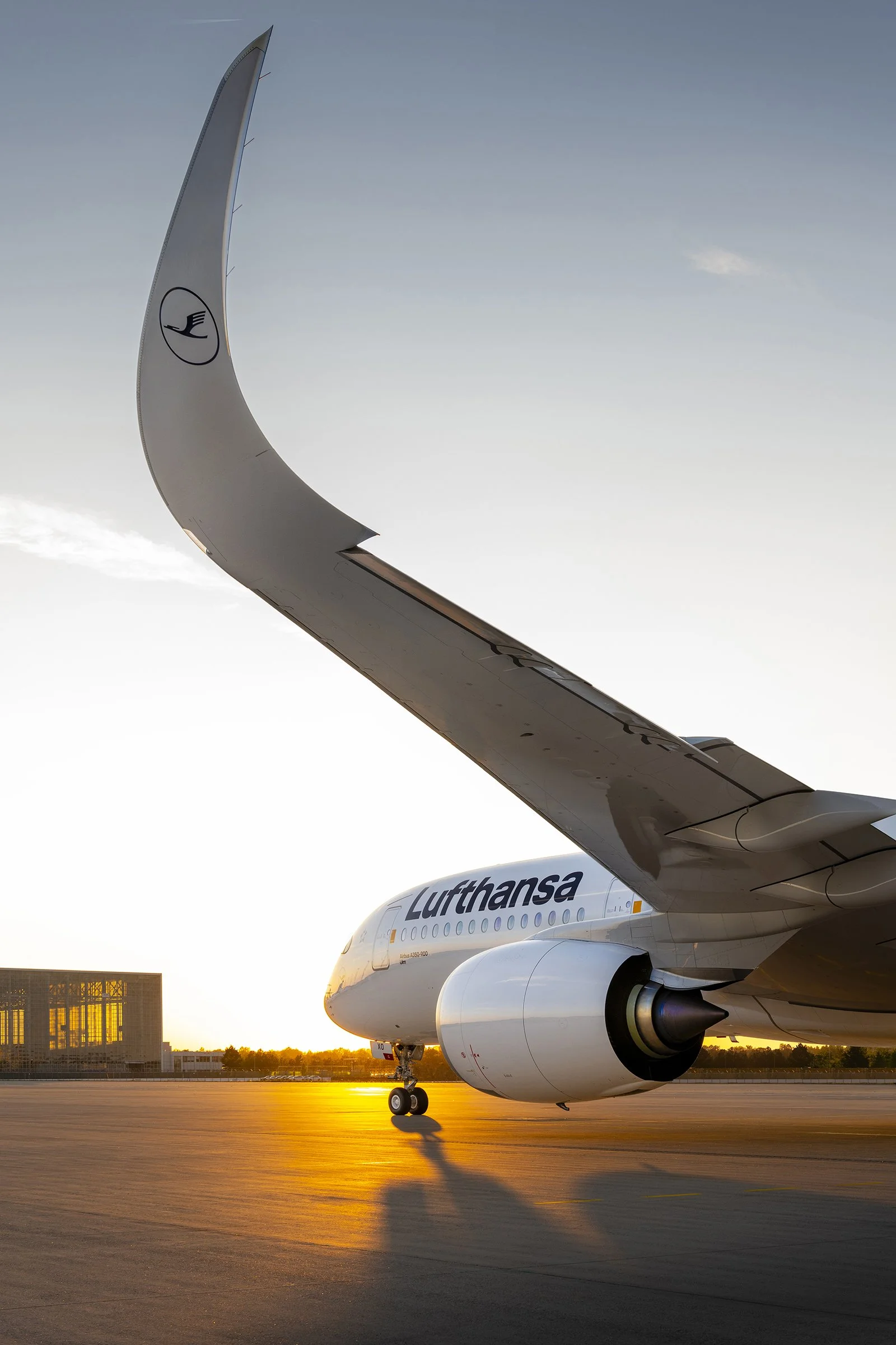
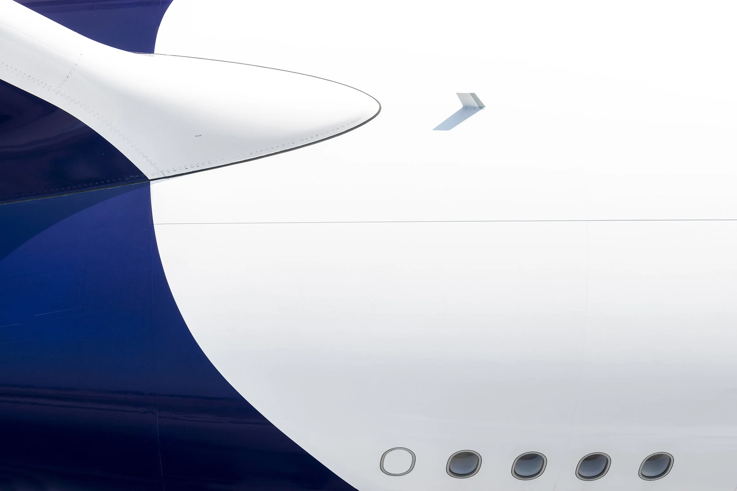
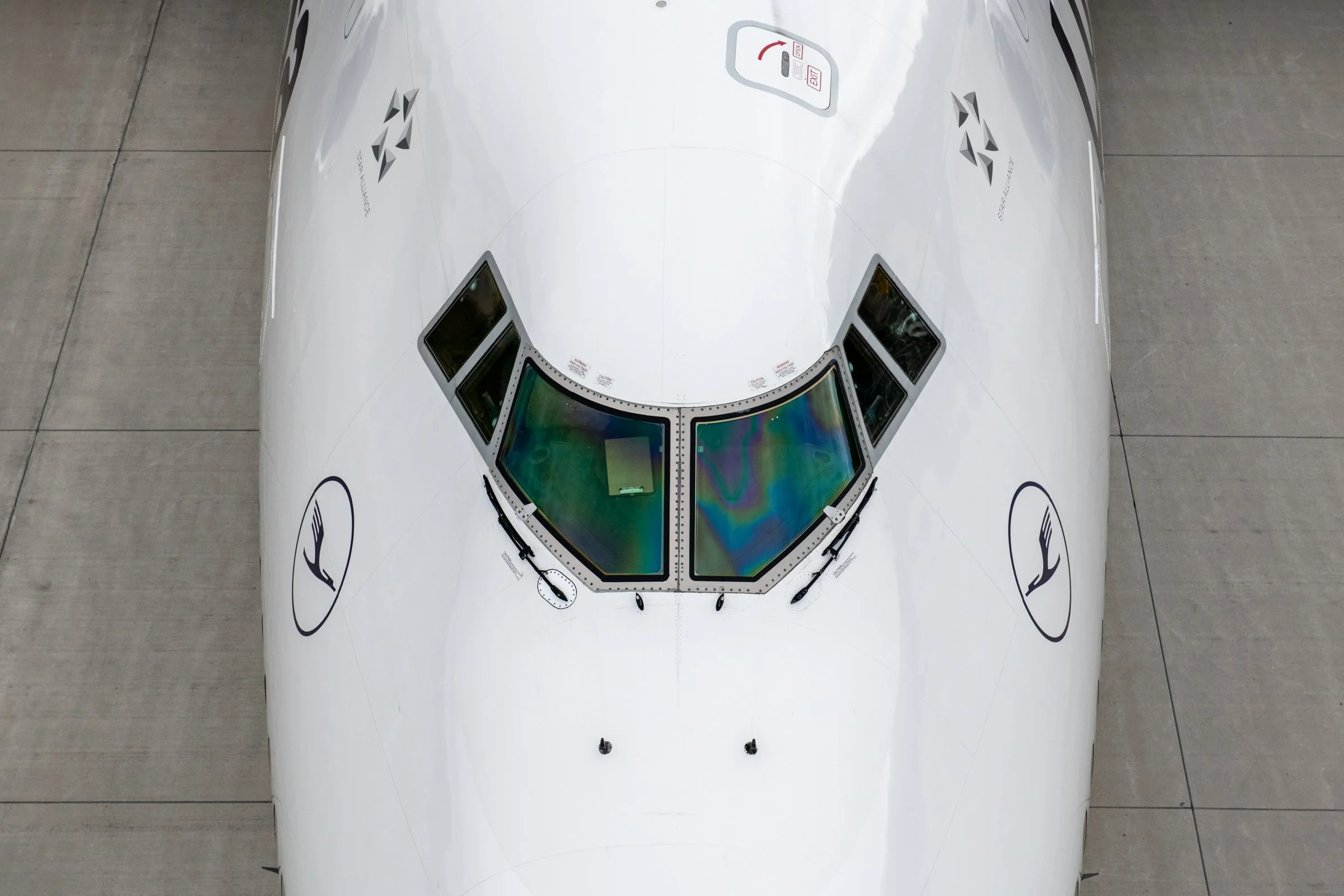
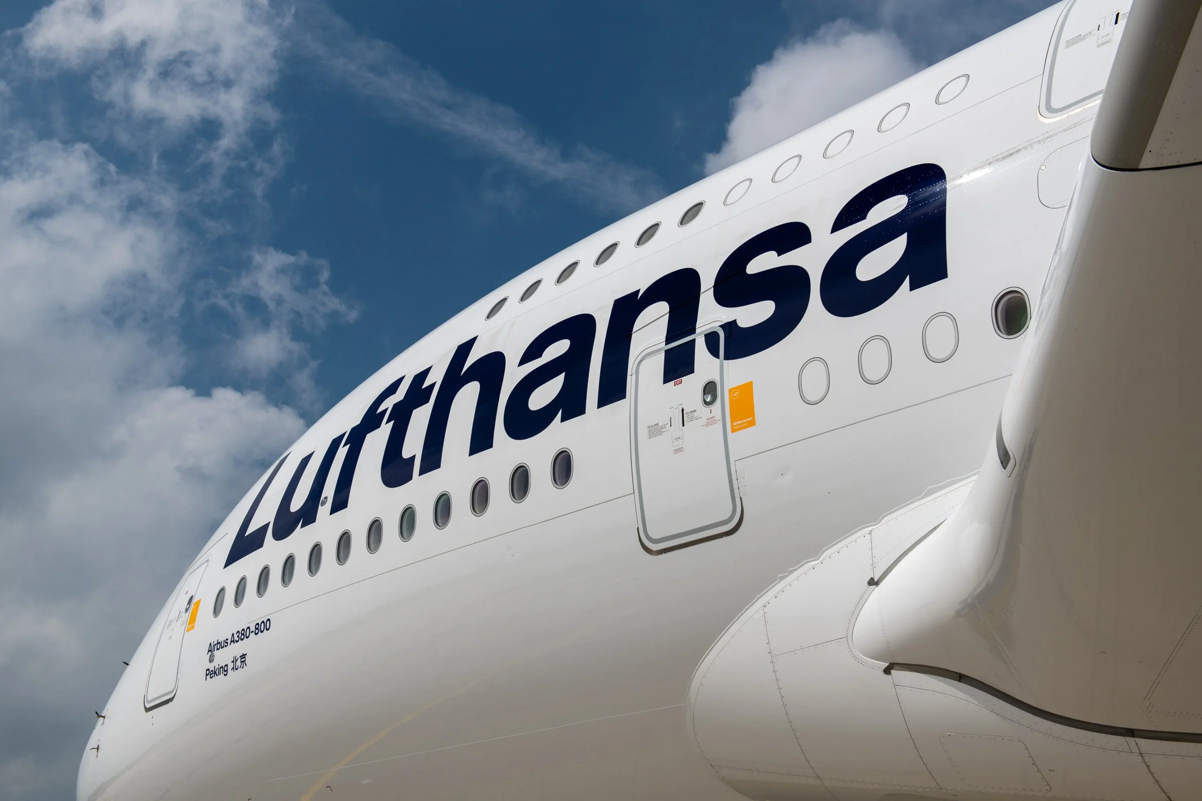
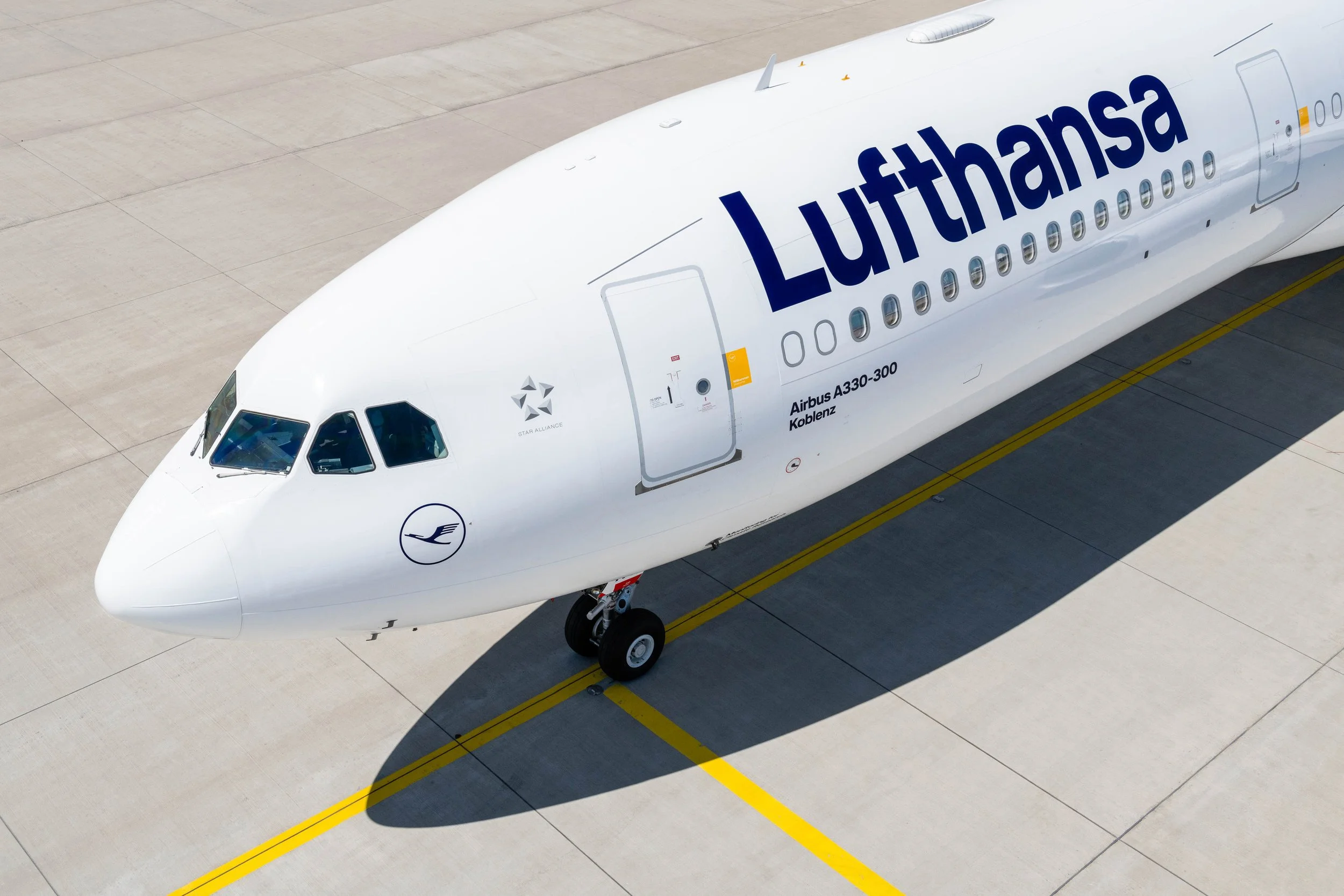
Rather than focusing on action or dramatic departures, I treated each aircraft as an industrial design object. The goal was to reveal the simplicity of the new livery through careful composition, geometry and negative space.
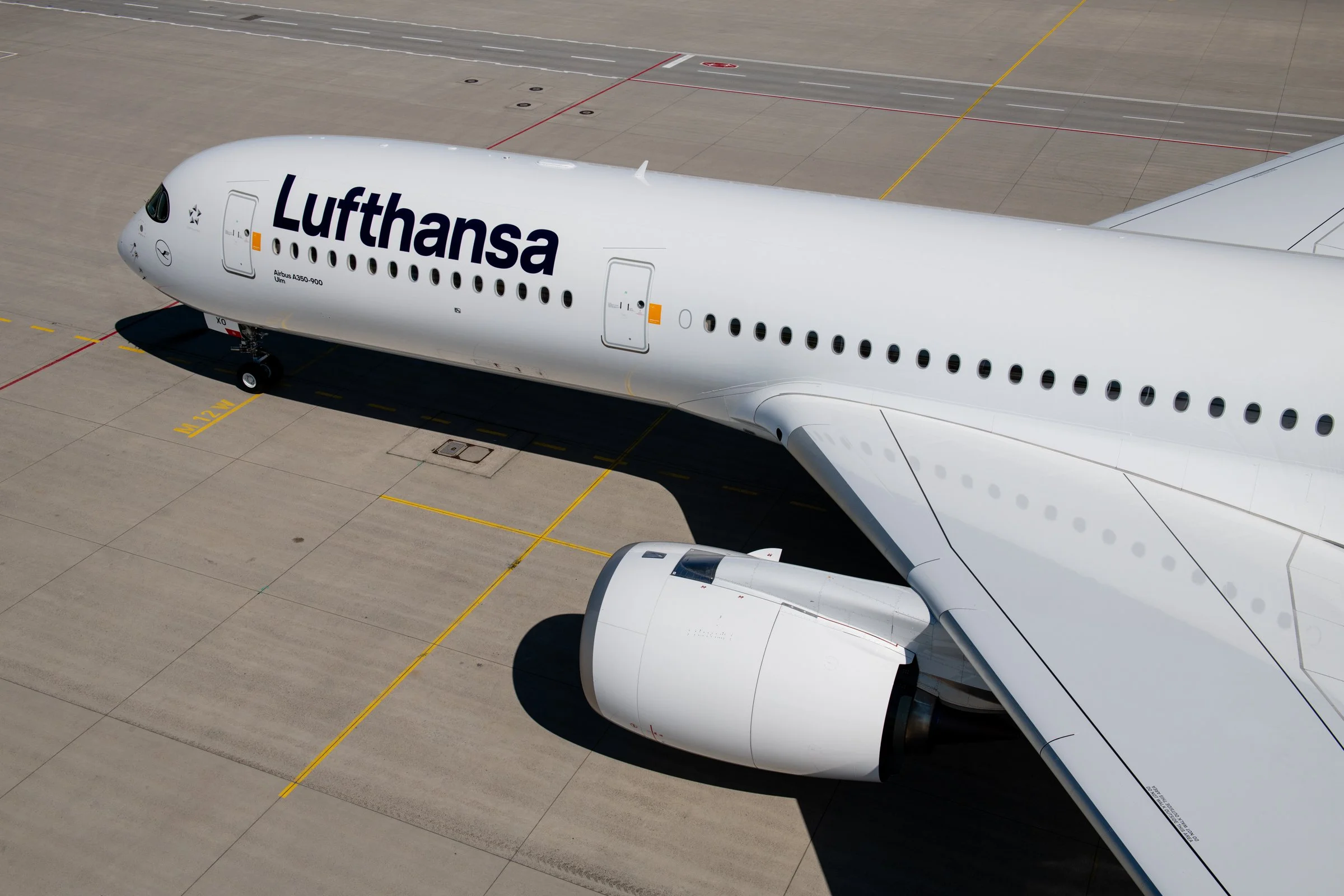
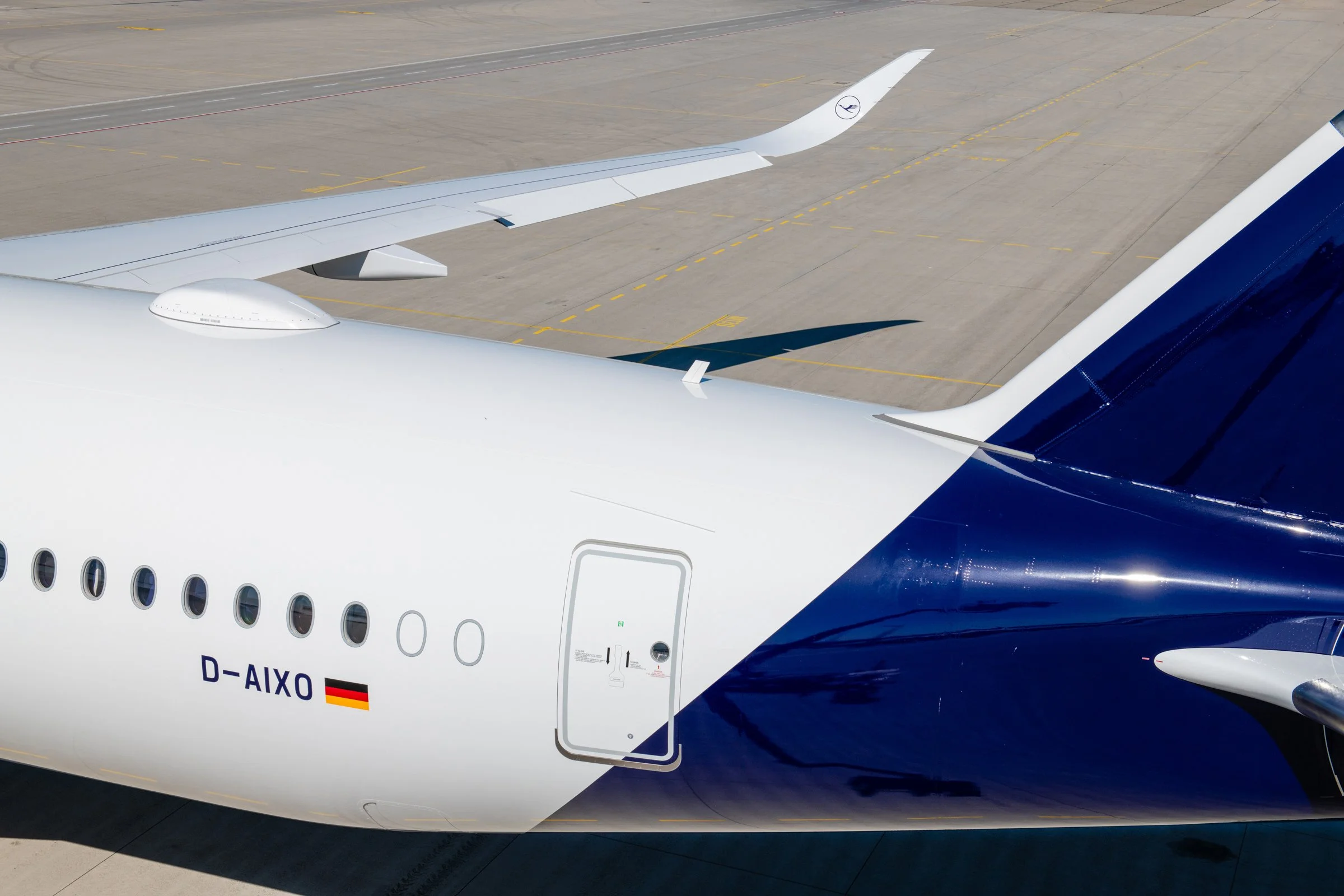
Before each shoot, I studied the unique proportions of every aircraft type to identify the angles that best showcased the new design. Wide-body aircraft demanded entirely different compositions from narrow-body or regional aircraft, but each image still needed to feel like part of the same visual system.
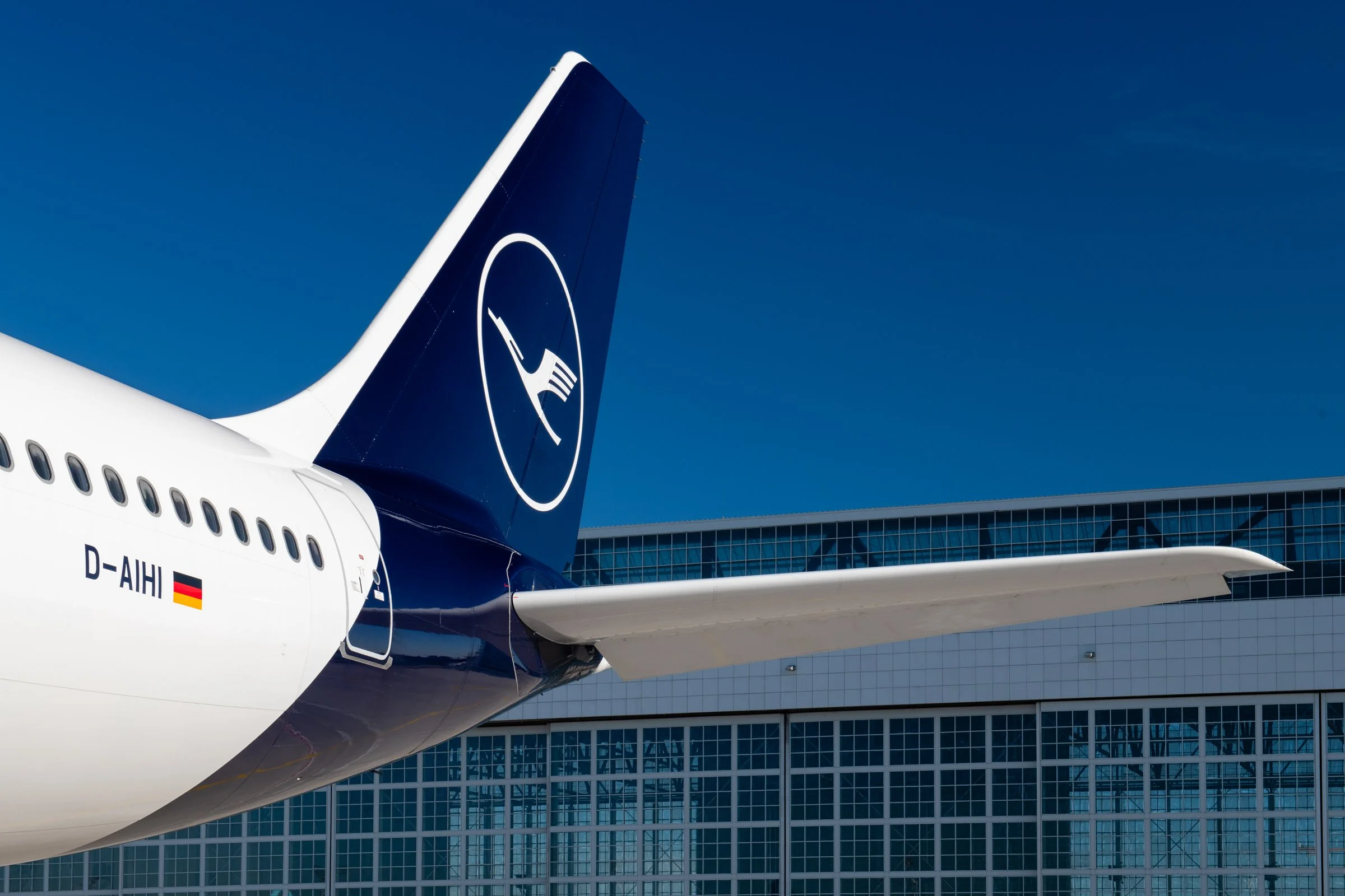
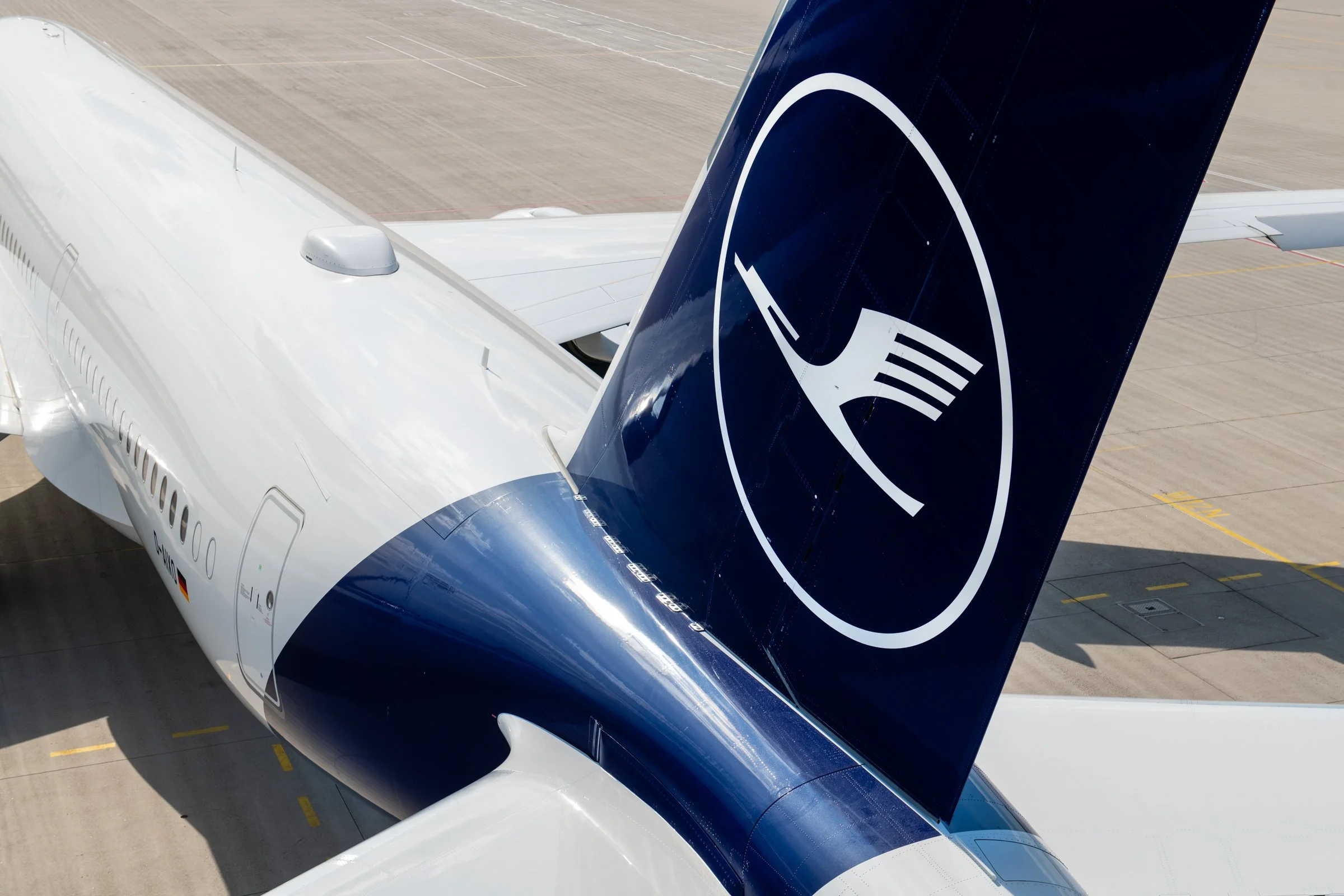
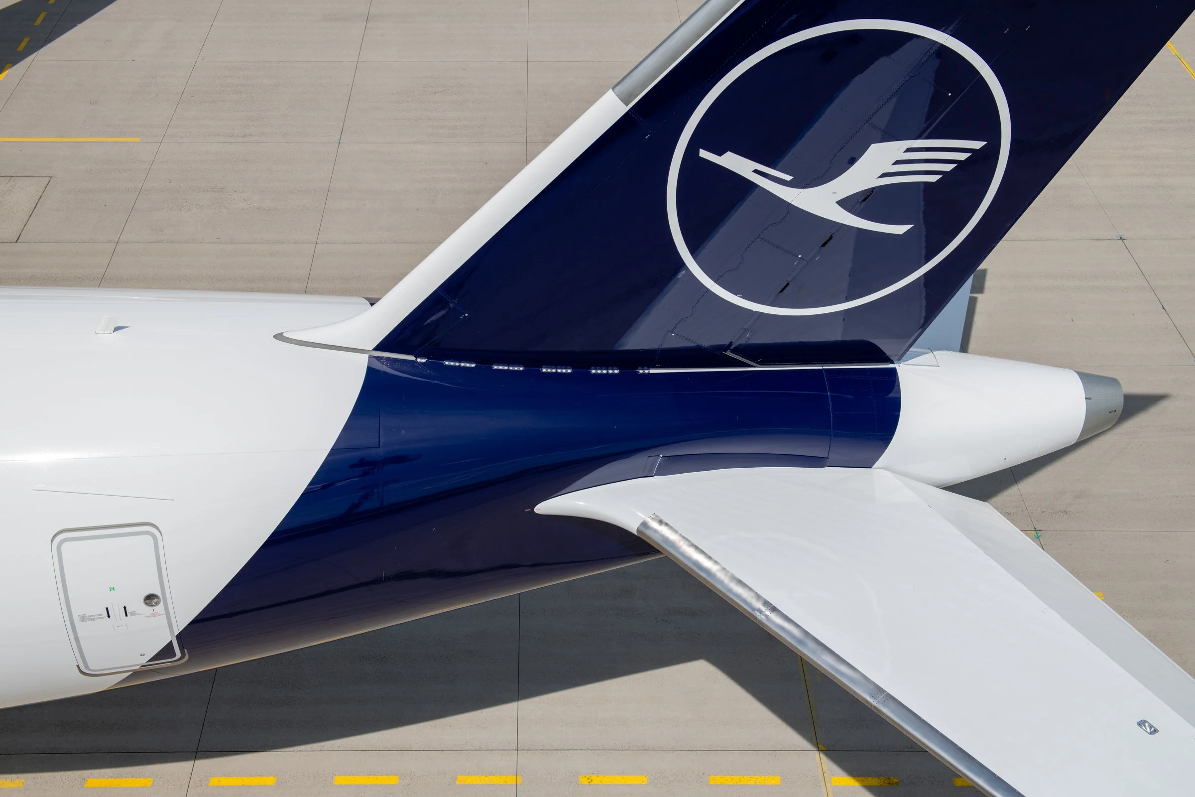
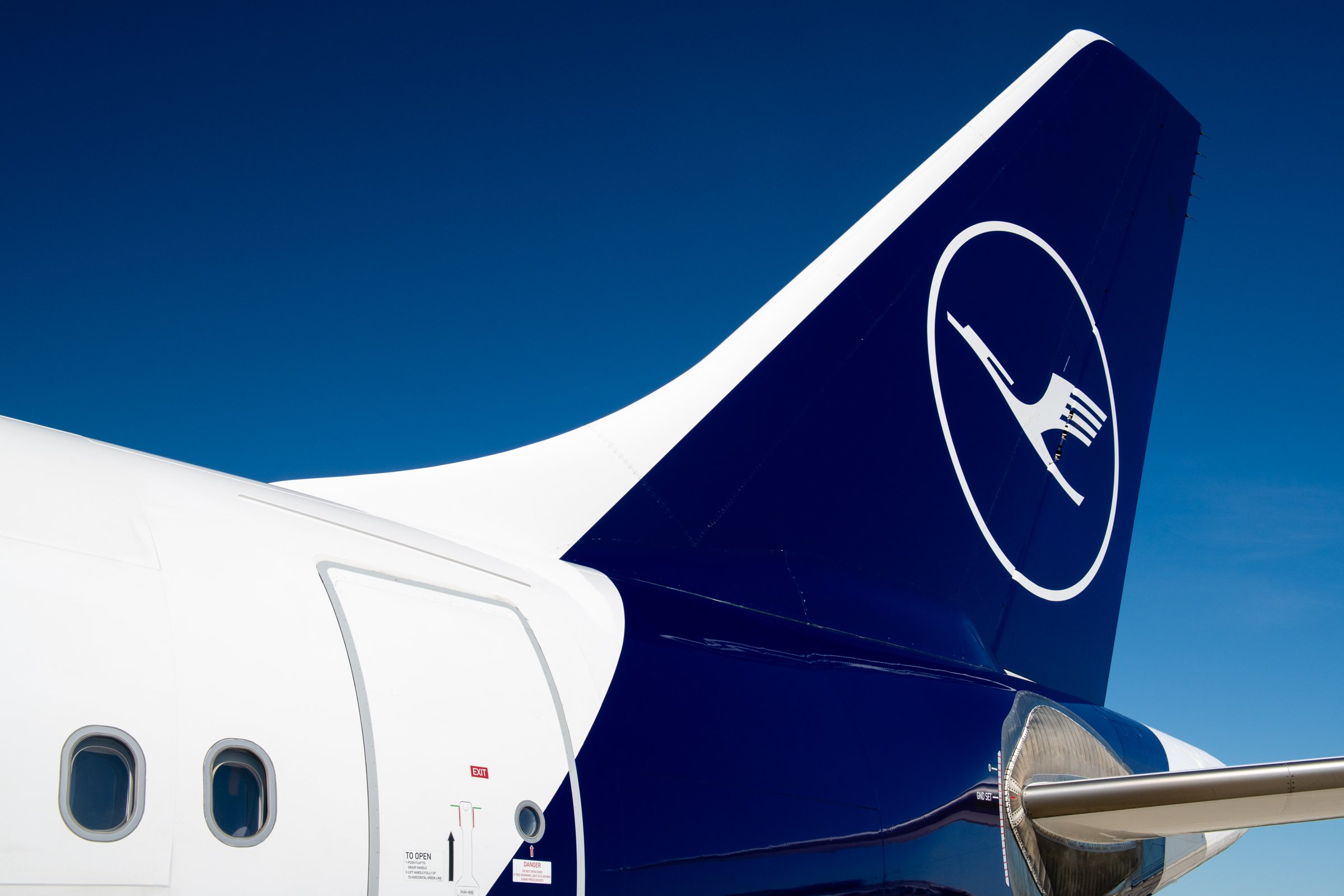
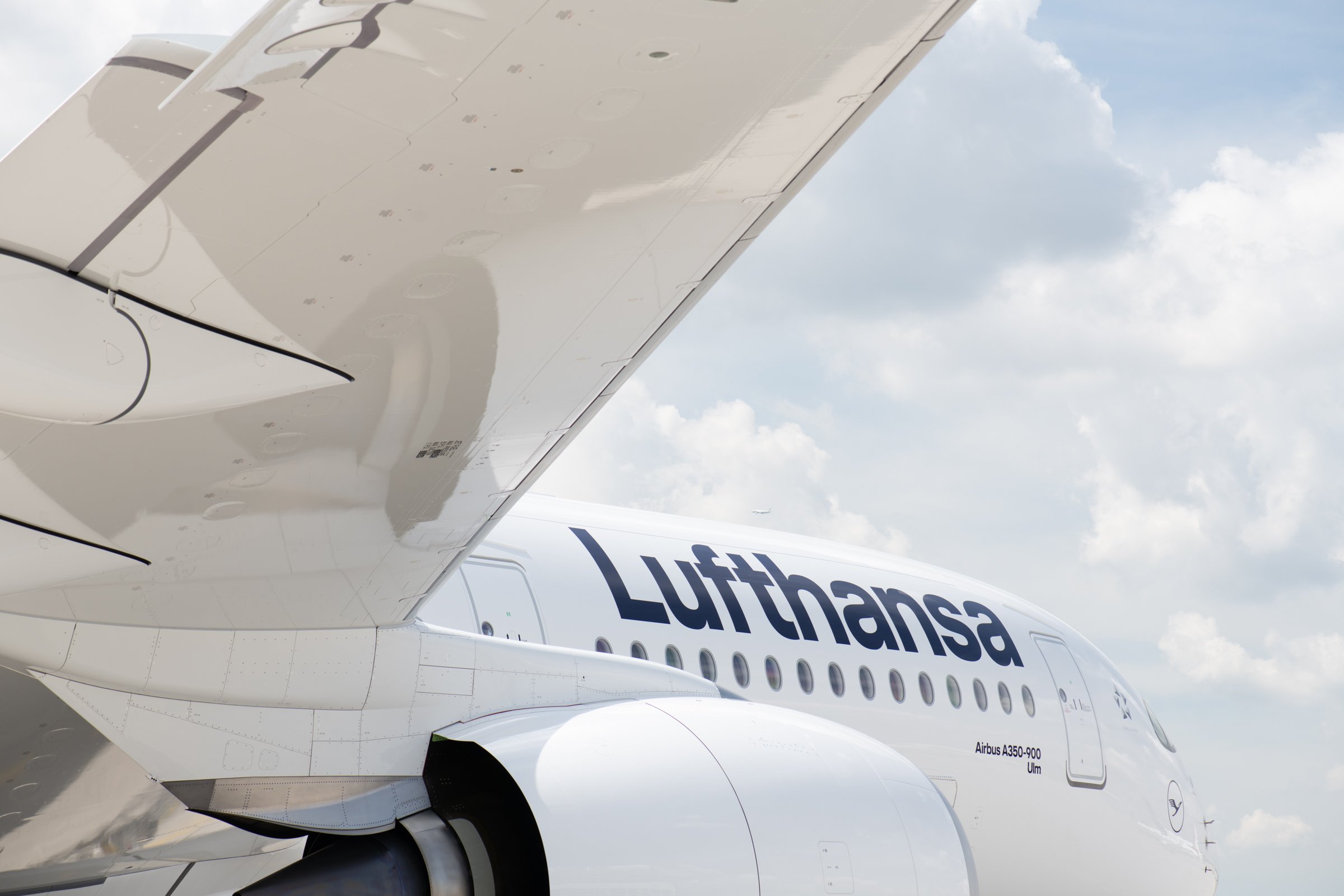
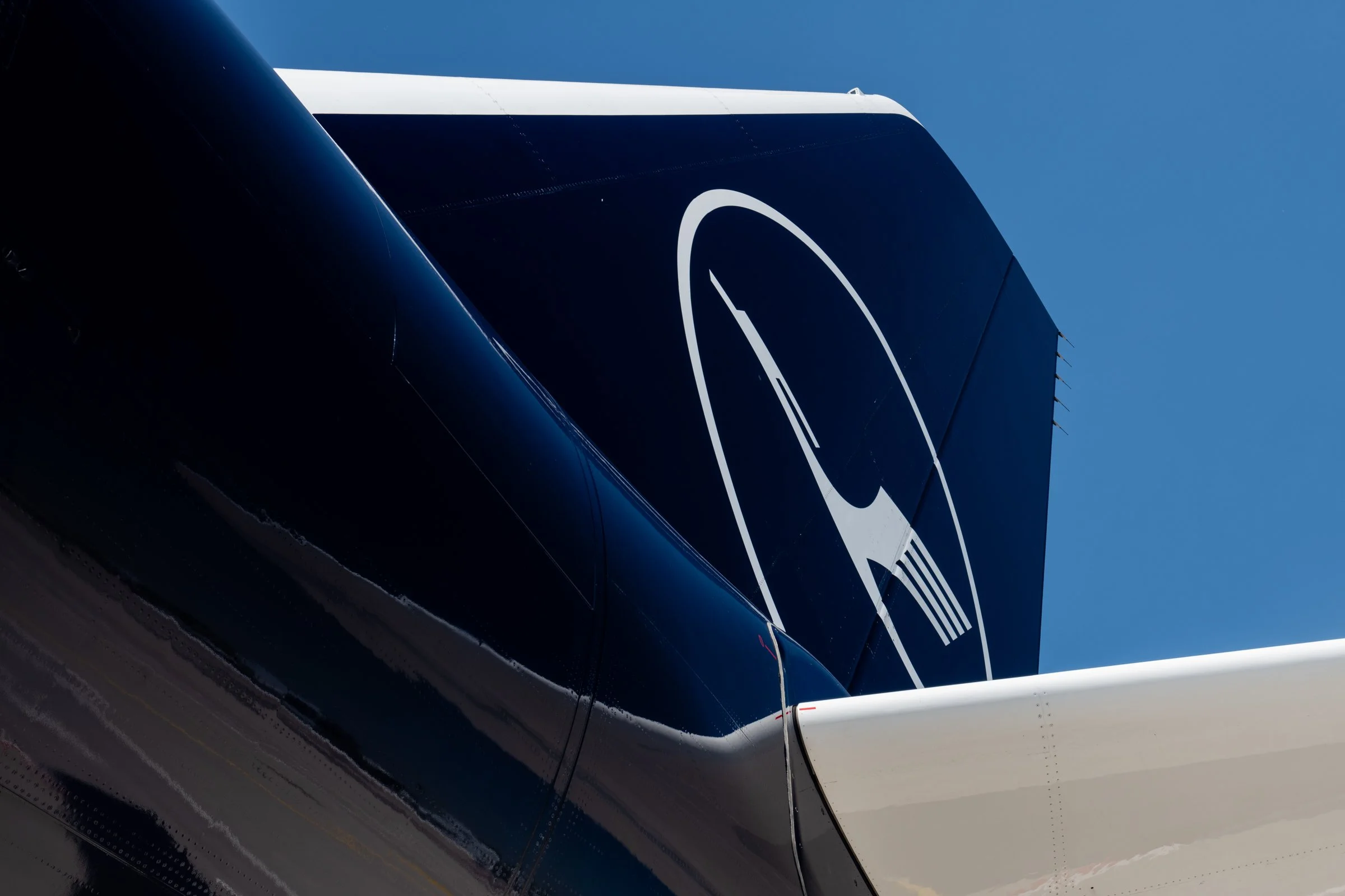
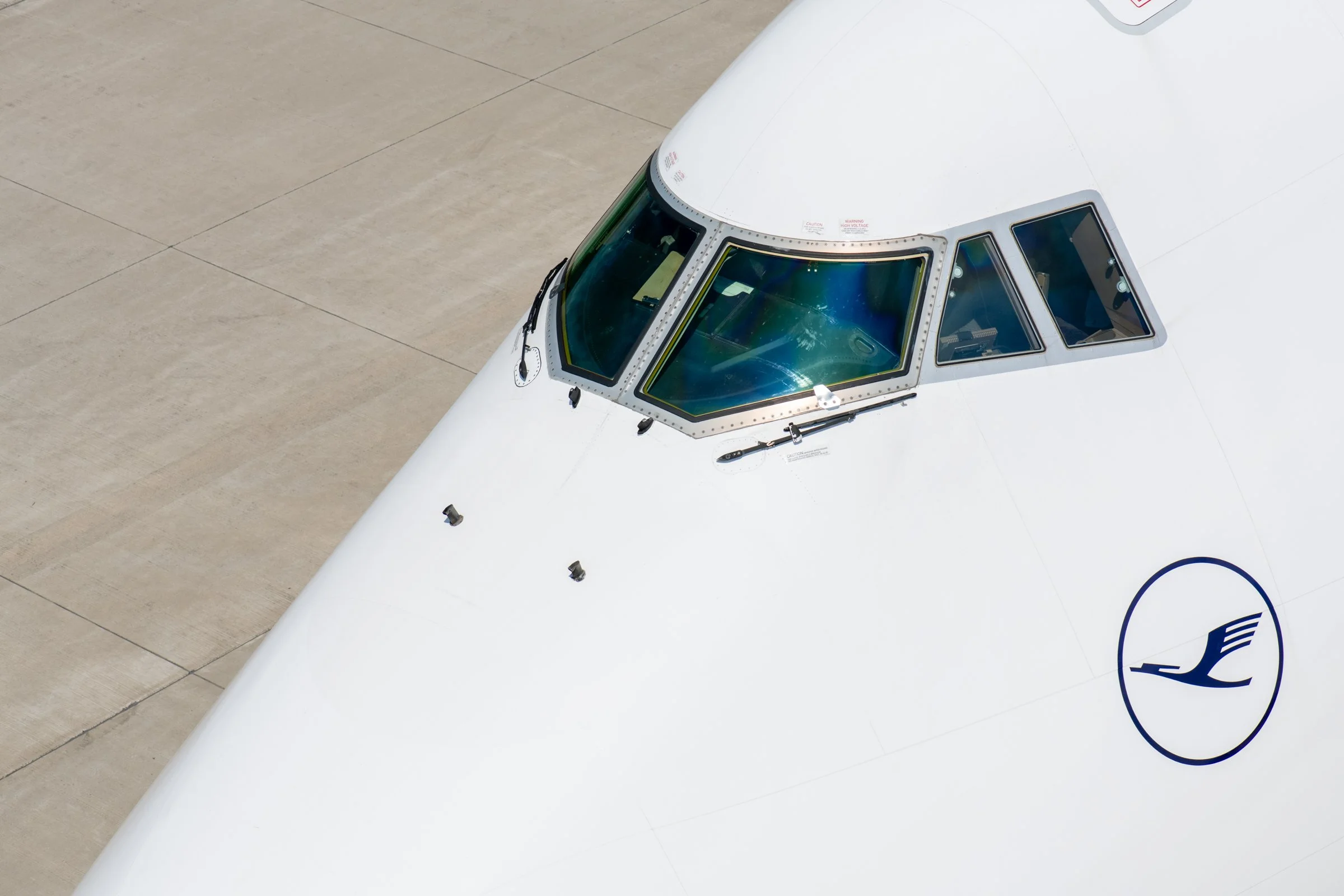
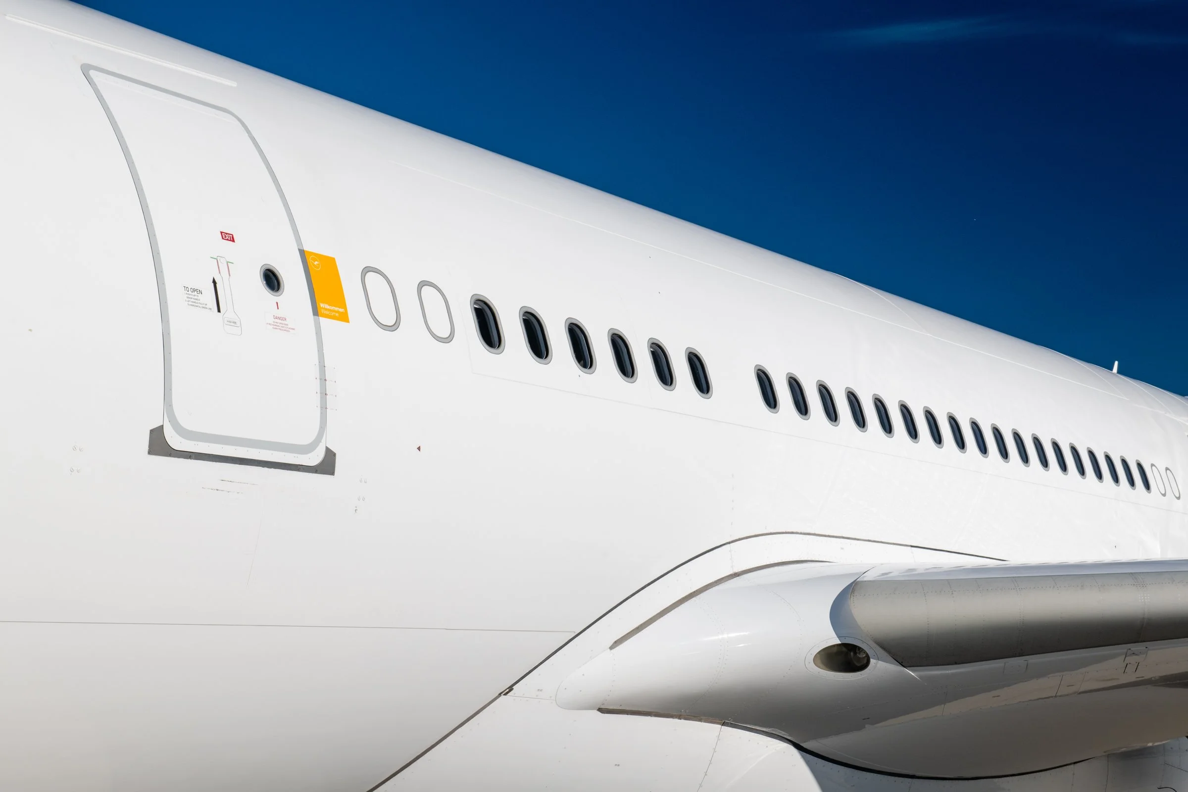
Lighting was equally important. I worked to produce clean, controlled photographs with minimal visual distraction, allowing the aircraft itself—and the subtle refinements of the new livery—to become the focus. Long telephoto lenses were often used to isolate graphic details such as the crane logo, winglets, cockpit windows and the relationship between curves and straight lines, creating images that balanced documentary photography with design-led storytelling.
The assignment was developed through close collaboration with Lufthansa's Brand Creative Director and Brand Management team, ensuring every photograph aligned with the principles behind the new corporate identity. This collaborative approach helped translate the intentions of the designers into a coherent photographic language that could be used consistently across every communication channel.
The Result
The completed library became the definitive photographic representation of Lufthansa's new visual identity during its global rollout.
The images were used throughout the airline's international communications, appearing across press releases, marketing campaigns, corporate publications, digital platforms and brand collateral. Beyond documenting the new livery, the photography helped establish a recognisable visual style that reflected the airline's renewed emphasis on quality, precision and contemporary design.
The project also demonstrated the value of combining an understanding of branding with specialist aviation photography. Rather than producing a collection of standalone aircraft images, the result was a cohesive visual system that supported one of the aviation industry's most significant rebranding programmes and became part of how the new Lufthansa was introduced to audiences around the world.